
Innovation in educational architecture stands as a fundamental element during the design process, especially in this era marked by constant revolutions in the educational field. Every day, new teaching methods emerge that require adaptive and avant-garde spaces. In this context, color emerges as a tool of great importance for architects, given its undeniable influence on the psychology and physiology of individuals.
Throughout this article, we will explore the impact of color in architecture, emphasizing its significance for innovation in educational architecture.
Colors are capable of evoking emotions and affecting people’s mood. Different colors elicit different emotional responses. For example, in a spa, soft tones promote relaxation, while in a classroom, colors inspiring concentration and inspiration are needed.
Throughout different eras, certain renowned architects have continuously explored the influence of color on users and how, based on this influence, it is possible to design sensory spaces that contribute to the physical, psychological, and cognitive well-being of individuals. An outstanding example is the work of Zaha Hadid, who boldly incorporated color into her avant-garde designs. This decision allowed her to experiment with organic forms and vibrant color palettes, creating spaces that defy conventions and stimulate the imagination.
All of this leads us to pose a question: ¿How does this influence of color act in spaces?
Innovation in educational architecture through color
In educational environments, the choice of colors goes beyond aesthetics; they have a direct impact on the learning experience and well-being of students, also influencing their perception of space. For instance, light shades can provide spaciousness and brightness to a classroom, crucial elements in creating a conducive learning environment. On the other hand, earthy tones associated with stability, a connection to nature, and warmth offer a comforting and familiar sensation.
In academic settings, the presence of these hues can induce feelings of security, creating an environment that promotes concentration and enjoyable learning. The neutrality and serenity of these colors can alleviate tension and foster an atmosphere for reflection and contemplation. In this context, the health and well-being of the occupants are critical considerations, necessitating the avoidance of excessively intense colors and excessive artificial lighting that could have a negative impact.

Color Palettes and Their Impact on Learning Spaces
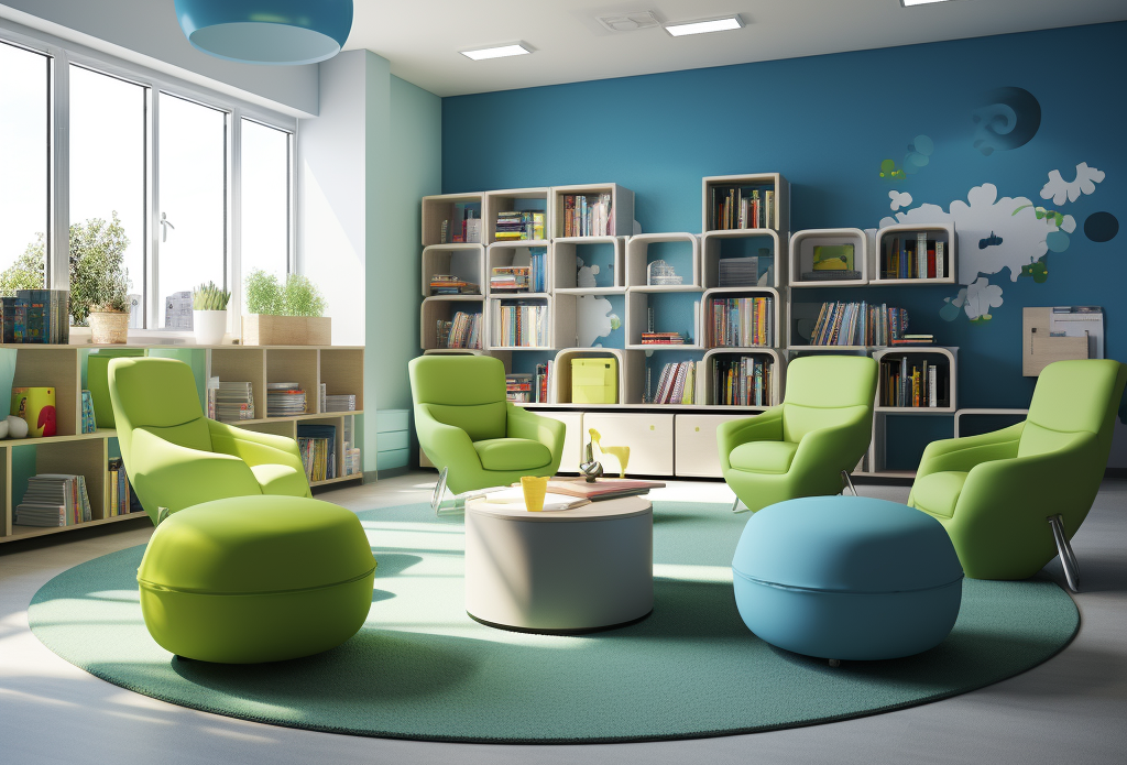
The selection of specific color palettes in educational environments is crucial when designing them. For example, shades of blue and green are associated with concentration and relaxation, making them ideal for classrooms and study areas. They create welcoming and comfortable spaces for tasks that require deep focus, such as solving mathematical problems or critical reading.
The blue hue, evoking feelings of serenity and stability, can positively influence students’ concentration abilities. The presence of the color blue in the educational environment can help reduce mental fatigue, promoting an environment conducive to learning and information retention.
Green proves to be an effective tool for reducing stress and promoting students’ mental relaxation. The strategic presence of green in classrooms and study spaces contributes to creating a serene environment that facilitates concentration and emotional well-being.
Warmer colors, such as yellow and orange, can foster creativity and social interaction, making them suitable for project areas and collaboration spaces that stimulate imagination and innovation. This inspires students to think more openly and engage in activities that demand creativity. Color psychology suggests that these colors can increase motivation, which is essential for approaching educational projects with enthusiasm and determination.
Orange has proven to have the ability to encourage open communication and collaboration among students. Its presence in educational spaces can cultivate an environment conducive to active participation, teamwork, and the exchange of ideas. Orange can improve students’ disposition toward social interaction, thus promoting an environment in which group dynamics flourish.
The strategic presence of the color yellow in educational spaces can create an energetic environment conducive to generating innovative ideas. This color prompts the mind to explore new perspectives, facilitating the connection of seemingly disparate concepts.
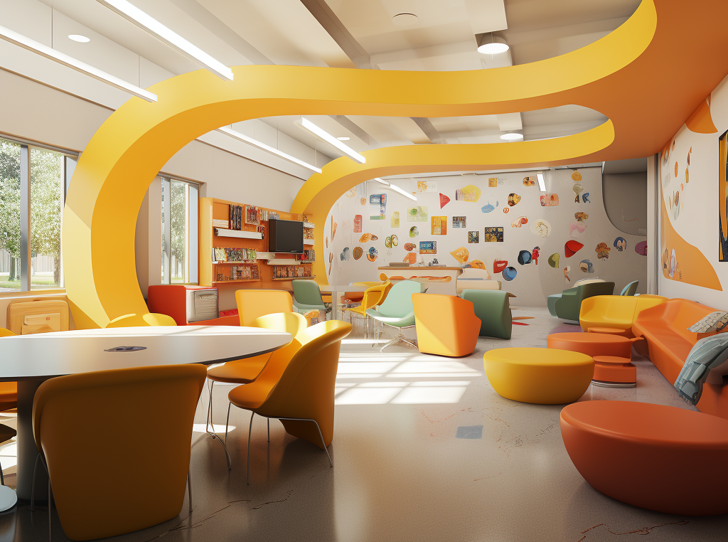
Vibrant colors like red and yellow can stimulate active participation by capturing attention through visual stimuli; these colors are particularly effective in areas where lively discussions and active engagement are desired, such as debate rooms or presentation spaces. Spaces designed with these considerations in mind can significantly enhance the quality of interaction.
In the educational context, red can play a crucial role in the quality of interaction among students. Research indicates that its strategic presence in educational environments can stimulate active participation and foster dynamic debates. When incorporated in a balanced manner, this energetic hue can generate a positive sense of urgency, motivating students to enthusiastically engage in discussions and collaborative activities.

Conclusion
We know that the conscious choice of light tones for study spaces, the strategic incorporation of earthy colors to provide emotional stability, and the use of vibrant colors such as red and yellow to stimulate active participation illustrate the complexity and importance of the color palette in educational architecture.
This holistic approach to the relationship between color and the educational environment highlights the responsibility we have as designers and architects in creating spaces that are not only visually appealing but also enhance the learning experience by promoting mental and emotional health.
At cr+a, we recognize that educational architecture goes beyond mere aesthetics; color emerges as a powerful tool to shape environments that positively impact health, well-being, productivity, and, consequently, student learning.
We invite you to explore how, in our project “Reinventing the School Library: CREA Project“, we innovatively approach the use of color as a generator of sensations and experiences in children and young people.
